Experiment 3: The Bridge
1) Final Lumion Design- The Bridge:
Lumion Dropbox Link:
https://www.dropbox.com/s/w6xy7zy1serj92b/Lumion%20Model.ls6?dl=0
Lumion Animation:
Lumion Environment Images:

Site view

Escalators to allow travel upwards from the main walkway

View of secondary building

Main Bridge walkway

View of Main building

View of Gallery and Workshops
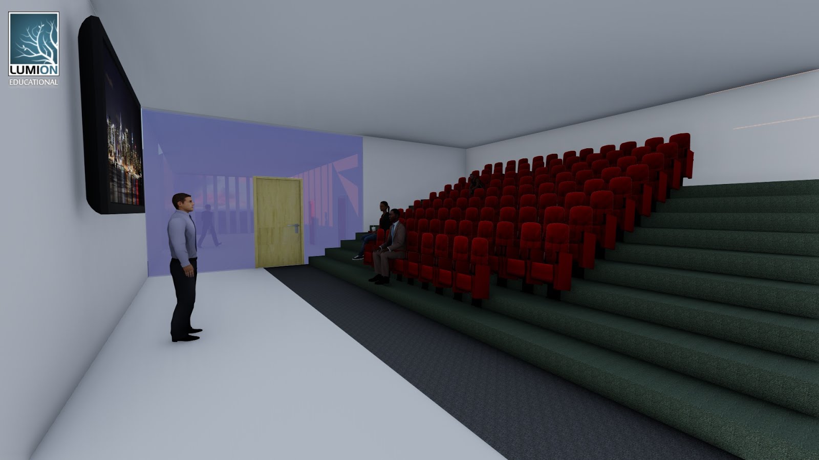
View of Lecture Theatre

View of Private study rooms

Site Plan
Moving Elements:
Element 1


As it can be seen from the above images, the moving element is a shutter-like element that controls the amount of natural sunlight that enters the lecture theatre. The transparent dome structure can be closed by the moving shutter, to allow the lecture room to be dark when presenting a video or powerpoint, or for any other purpose.
Element 2
The second moving element is a lift which takes the occupants from the first floor of the main building to the second floor.
Addition of Textures in Model:

The textures are placed in the gallery, on the temporary walls.

The textures are also placed on the roof of the escalator, as it is situated near the main walkway, allowing a larger volume of people to appreciate it.
2) From Plan to Section:

The two plans that drive the section design of the Bridge are Zaha Hadid's "Vitra Fire station" which is included in the main building, and Le Corbusier's "Villa Savoy" which is included in the secondary building.
3) Mashup of three articles:
Title/Concept: Architecture as an expression of Organic movement:
Organic architecture is
architecture designed to harmonize with its environment
and integrate itself with its site, into a coherent whole. Organic architecture is not a style
of imitation, but is concerned with … the site,
the people who will occupy the buildings and a
reinterpretation of nature’s principles. Organic architecture is not strictly governed by seldom
curves[ed], and are… never free form, [but rather] the building derives its form partially from the
nature of the site. The building grows out from the landscape, providing occupants a connection to the exterior
environment. Organic architecture involves a
respect for the properties of the materials, [such that] the form of the building should be an expression of the
nature of the materials used.
4) 36 Textures:

From left to right: Rotational, Scalar, Linear, Fluid, Expand, Harmonious.
5) 18 Perspectives:

Set 1

Set 2

Set 3

Set 4

Set 5

Set 6
Experiment 2: UNSW Light Rail Stop
Lumion Scene link (available via Dropbox):
https://www.dropbox.com/s/2jp3k5owrnnh3p8/Tram%20stop%20%28Final%29%20%28Lumion%29.ls6?dl=0
Concept:
Theme: Multiculturalism
The theme of Multiculturalism is interwoven
in the design of the light rail stop and is an essential theme to consider in
the context of the UNSW light rail stop. Due to the vast numbers and
disparities in the cultures of the UNSW students, creating a stop that embraces
such a multicultural demographics would be highly successful in the sense that
it allows the architecture to better communicate and emphatise with the
students. The theme is emphasised in the vivid colours of the twisted, organic
columns of the design. All of the lower columns are painted in the Australian
colours (blue, green and gold). As the column spirals up, the colours change to
the ones of different countries and cultures around the world (i.e, China, USA,
India, Germany, Brazil etc.). Such a play of colours signifies how the
demographics have changed from being a predominant single culture, to a branch
of different cultures that can equally be embraced and recognised by the
public.
Two Architectural Concepts:
Amanda Levete: Organic motion
The notion of organic motion, primarily
focus on the movement and dynamism of a form or a structure. Such a form
creates a sense of liveliness, harmony and naturalness, which can be lost in
modern architecture. In my particular design, the way the columns twist and
thrust upwards mimics Levete’s use of Organic motion in her designs. This is
reinforced by the slightly arced shaped of the roof as well as the twisted,
superimposed rectangular tram signs.
Rudolf Schindler: Geometry as a tool for
spatial organisation
The notion of geometry as a tool for
spatial organisation focuses on how the synthesis of different geometrical
shapes and forms can create spaces, which may be linked through some sort of
transitional phase or perhaps may be separate. In my particular design, I have
used this notion of geometry to create the sitting area of the rail stop.
However, in the bigger picture, this geometry indirectly creates subspaces
within a larger space. Linking back to the theme of multiculturalism, it
reiterates the notion of how people have different cultures and backgrounds but
are still connected and equivalent. This interplay of differences and
connectedness is further reinforced through the visual continuity of the space,
that is, people are not separated and blocked from enclosing walls that create
a more definite space.
Final Design of UNSW Light Rail Stop:

Site Plan (Aerial view) - Showing the context around which the Light Rail stop is situated within. The Scale of
the light rail is appropriate, as the structures surrounding it are quite large.

Closer Site Plan (Aerial view) -- Showing a Southern view of the Light rail stop.

This shot clearly depicts the scale of the people with the scale of the architecture. It is proportioned to the human body, creating a better experience. The photo also shows the complex geometry of the space which mentioned before relates to the theme of multiculturalism.

A perspective shot reiterating the appropraite scale of the light rail stop. The design doesn't over empower or belittle the observer. The shot also shows the organic motion of the tram sign. The use of light to dark textures reinforces this architectural concept, in the sense that it all about the movement of forms, in this case the movement and transition from light to dark.

36 Textures:

Chosen Electroliquid Aggregation (In Lumion):

In Lumion, the concept of "Organic Motion" has been transformed into a curved surface which is arranged with the rectilinear form of "Geometry". From this combined form, I have transformed the curved surface of the form to a series of twisting tubes which organise together to form an "Organic Column". The Rectilinear form has been made more complex to create different spaces and experiences for the public.
Chosen Electroliquid Aggregation:

The above Electroliquid Aggregation synthesis the architectural concepts of "Geometry as a tool for spatial organisation" and "Organic Motion".
12 Axonometrics:

... End of Experiment Two.
- Experiment One
Three Clients:

Givenchy
-Bike (noun)
- Powerful (adjective)
-Accelerate (verb)

Givenchy
-Dessert (noun)
- Mouthwatering (adjective)
- Digest (verb)

Givenchy
- Cologne (noun)
- Aromatic (Adjective)
- Permeate (verb)
36 Texture Sketches:

18 Section Sketches:


Sketch up Model:


The Stair:
Stair 1

The stair above shows the journey from the ground floor to the upper level of the Givenchy Showroom. The two spiral stairs has a sense of elegance about them similar to the colognes in the showroom. As the client walks up the stairs, the stair risers get thinner and thinner, creating the feeling that they with the stairs are floating. Ultimately conveying a sense of "lightness" and "purity" in the upper level, paralleling to the notion of walking upwards towards the heavens.
Stair 2

The stair above is based on the word "Digest", and is the path the clients take to come downstairs to the Food Court. The long and twisted path of the stairs replicates the process of digestion in the human body. In addition, the lengthy journey of walking down the stairs gives the clients a greater appreciation of the time it takes to make good quality food which will be served to them.
Stair 3

The stair above is based on the word "Mouthwatering", and is the path the clients take to come downstairs to the Food Court. The cylindrical fountain accompanying the clients as they walk down the stairs is a literal approach to designing the stairs based on the word. It acts to create eagerness and a sense of curiosity within the clients. The long, spiral shape again emphasises the effort and time it takes to make such food, allowing the clients to appreciate the food that is being made.
Stair 4

The stair above shows the journey from the ground floor to the upper level of the Givenchy Showroom. The upwards thrust of the balustrades conveys the notion that there lies something more important above in the upper levels. Thus, clients are intrigued about what may lie beyond these stairs. The semi-circular glass path separating both stairs allows the clients to look down and appreciate that they are higher than everyone else and that something more important lies above the second set of stairs. The notion of "floating" is again emphasised due to the absence of the stair risers.
Sketches of Additional Stairs:
Stair 2 (Image 1): Above Ground

Stair 3 (Image 1): Below Ground

Stair 4 (Image 1): Above Ground

Stair 3 (Image 2): Below Ground

Stair 4 (Image 2): Above Ground
Three Animations:
Animation 1 Final
Animation 1
Animation 2- Dhaval Shah
Animation 2
Animation 3- Dhaval Shah
Animation 3